Designing the journey to purchase home insurance
ABOUT
Purchasing a home insurance can be daunting. A redesign & refresh of the home insurance purchase journey was planned by the business to simplify the purchase journey to improve overall purchase experience.
01
DISCOVERY
PAINPOINTS
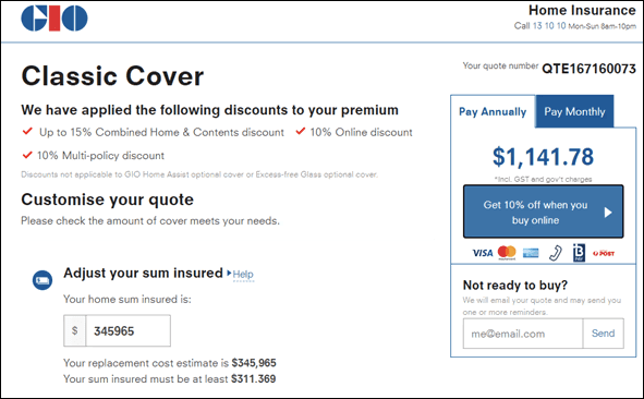
The old journey to buy a home insurance policy involved long forms that is perceived to be too long and complicated to complete. The overall experience looks crowded and this increases cognitive load.
Old experience example:
HIGH LEVEL GOALS
Leveraging clever copy to transform long form questions to single page question interactions
Re-organise information hierarchy and reduce clutter
Using white space to create more breathing space along the journey with the goal to improve comprehension when going through the journey
02
PROCESS
FEATURE HIGHLIGHTS
There were a few key features in the project that we paid more attention to. These include :
Breaking down long forms into single page questions
The direction on quote summary page
Use of progressive disclosure pattern
Defining clickable links
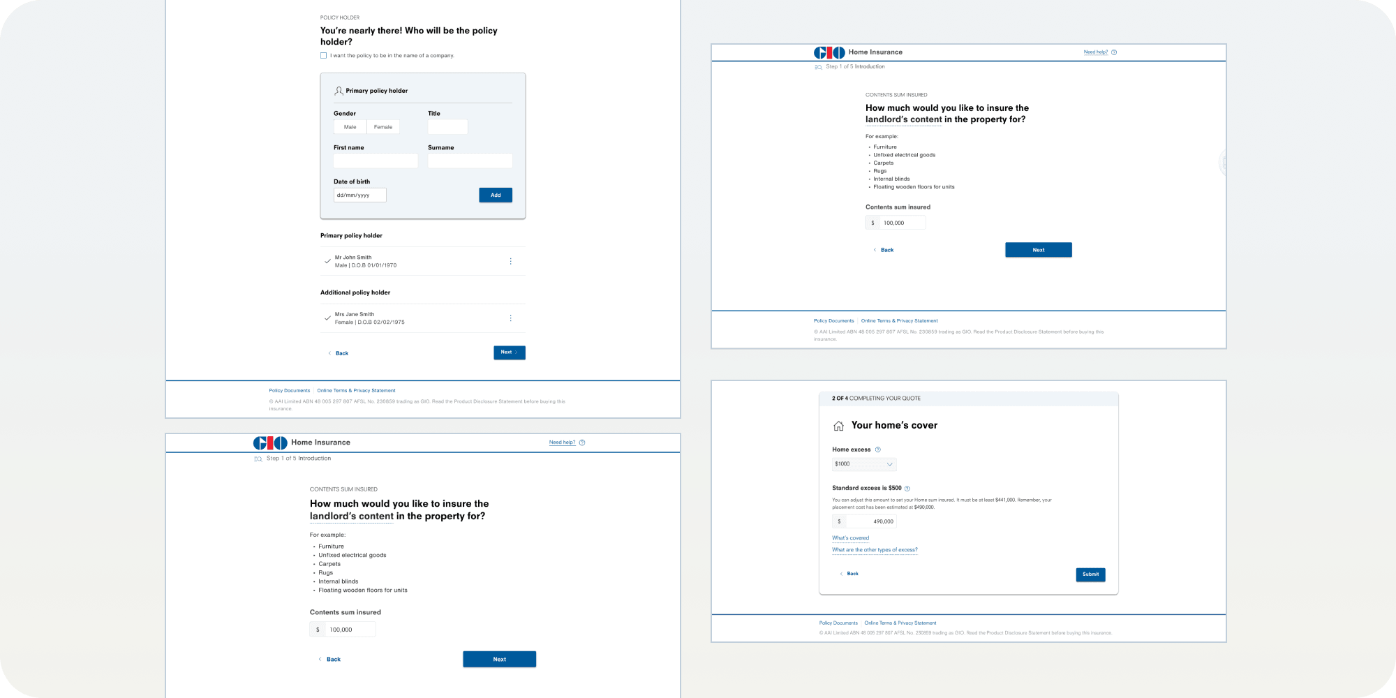
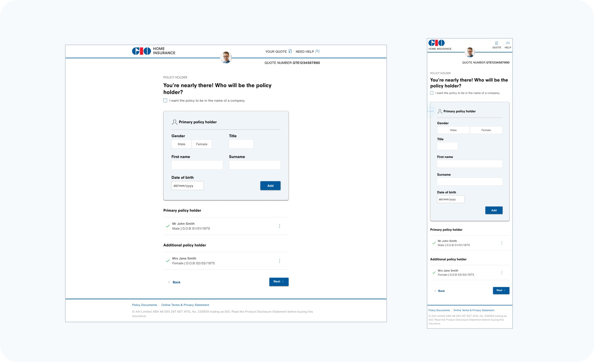
Single page question design
Single page questions break down long, complex tasks into multiple smaller pieces and place these on screens of their own. This allow users to comprehend and process each question that are presented to them. That way we could explain the technical aspect of home insurance which is not always easy to comprehend.
Single page question complements mobile-first design and add a sense of progression, which leads to a overall better user experience.
example of single page question flow :
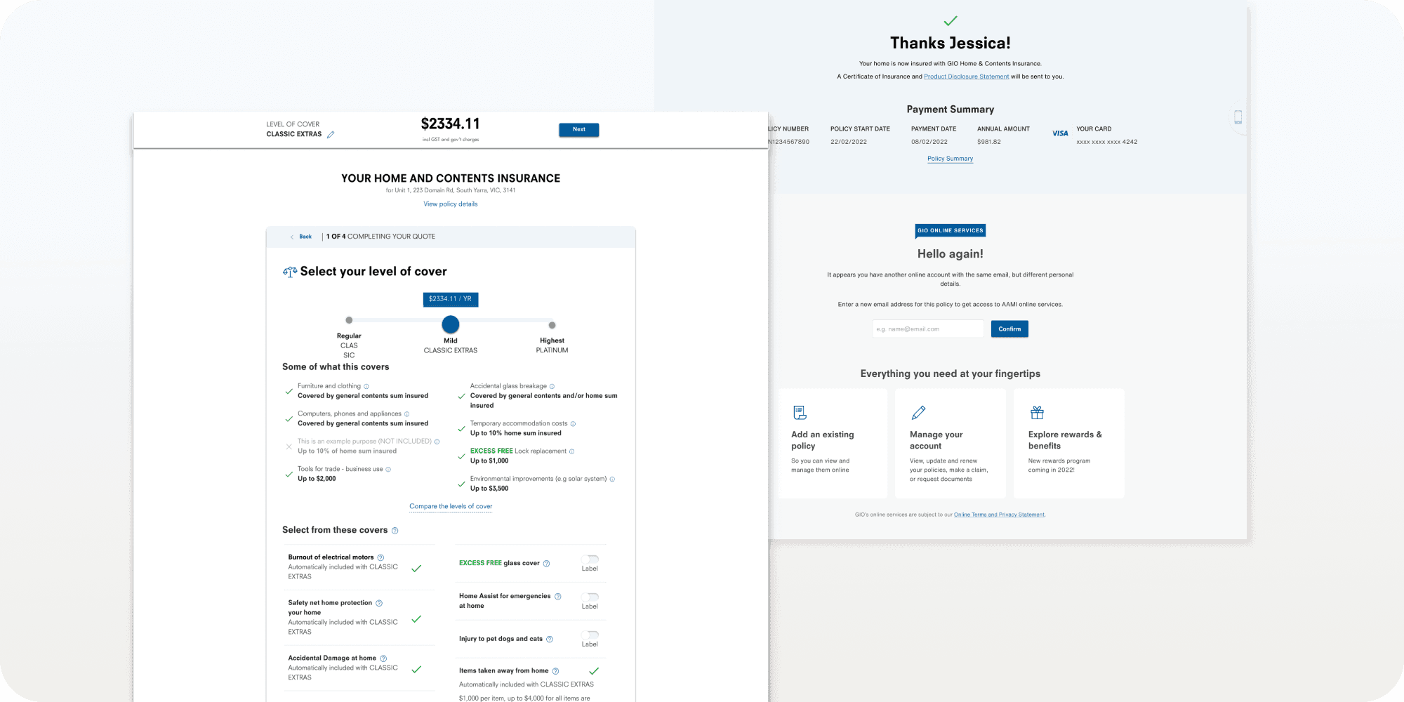
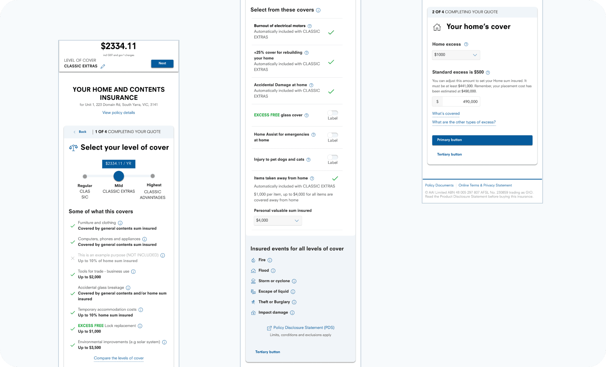
Quote summary page
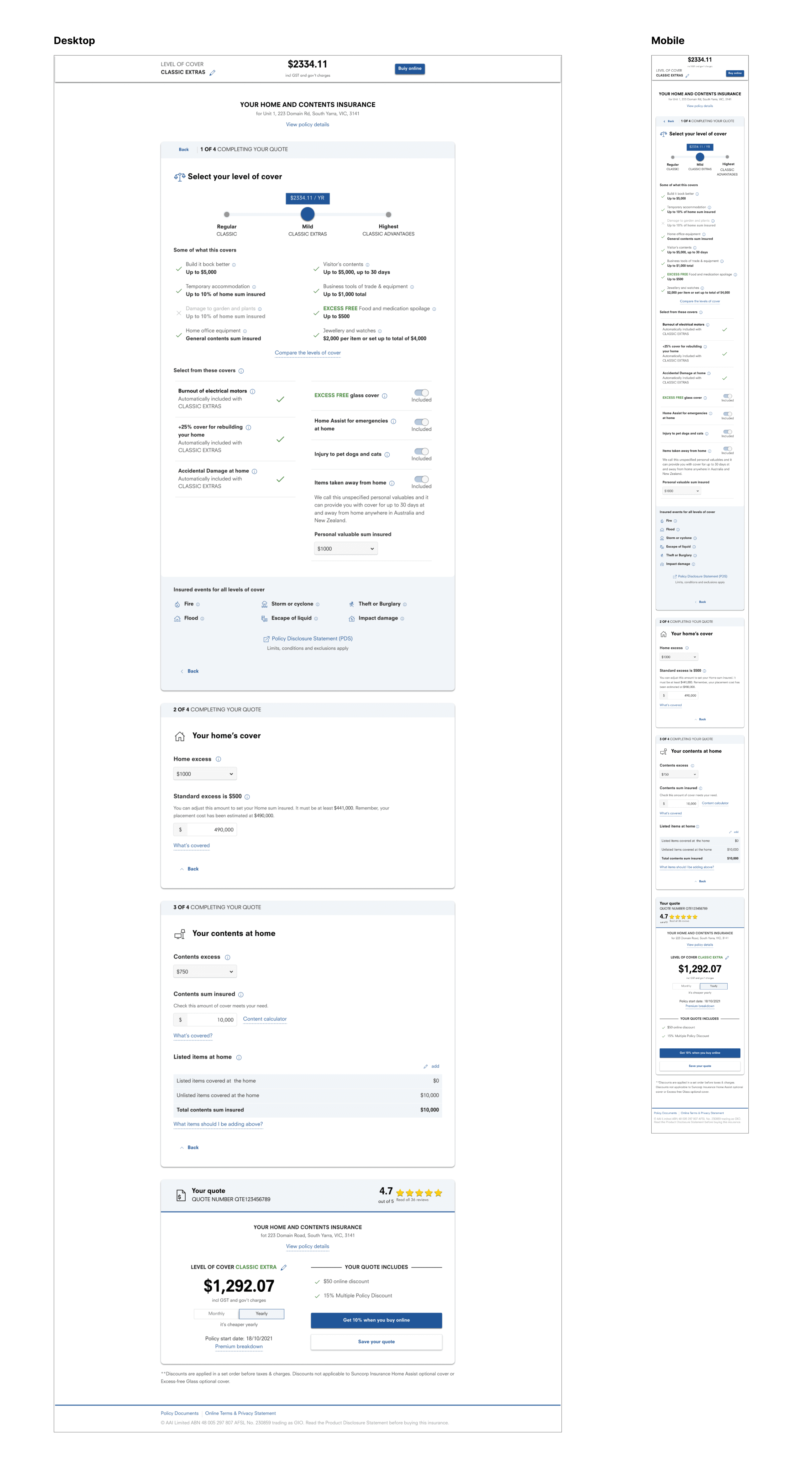
On this page, we want to encourage users to customise and adjust the toggle to get a cover they are happy to pay. The challenge here is to organise all the information in a clean and organised way to ensure we have all the controls whilst ensuring a visual balance on the page.
Progressive disclosure pattern
Smaller cognitive workload -
Progressive disclosure simplifies user interactions by focusing the user’s attention on the most relevant task at hand, while revealing additional detail only upon request (next button). As a result, the user is able to comprehend what is required for them to move through the questions, minimising the action of “scanning pass” information.
Cleaner user interface - by hiding other content, the user interface looks less cluttered and appear more simplified on the initial scan.
RESULTS
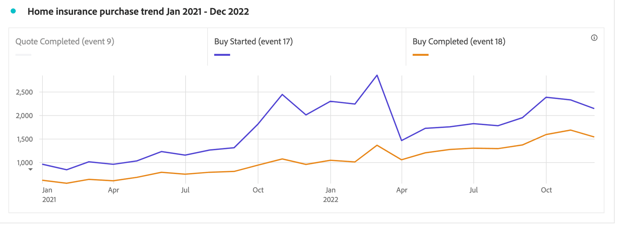
Post launch for GIO Home Insurance, conversion in home insurance policy by about +24% average. Graph is illustrated below :
03
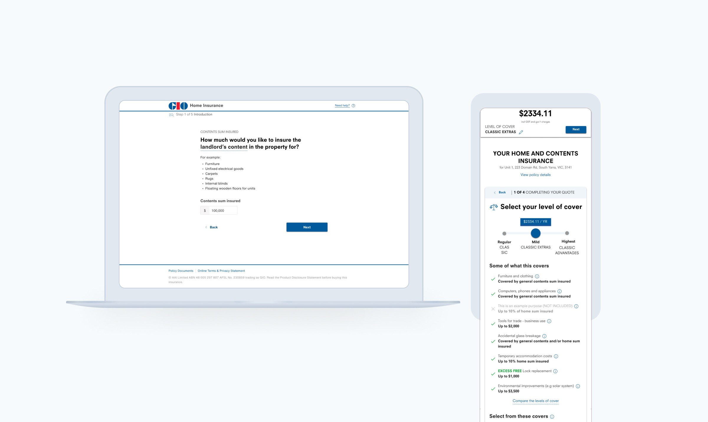
FINAL DESIGN
