For Australia fundraising platform - GiveNow
ABOUT
GiveNow wanted to engage a designer to redesign their donation payment platform to improve the usability of their donation payment flow.
01
DISCOVERY
PROBLEM
The donation page form elements did not meet accessibility requirements
The business wanted to make the donation flow customisable according to different organisation needs for the campaign
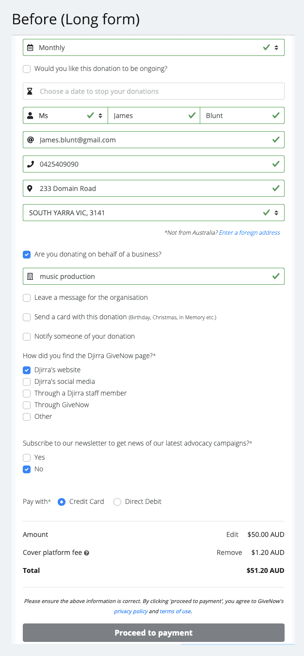
The business want to simplify the donation form to increase the donation completion rate
GOALS
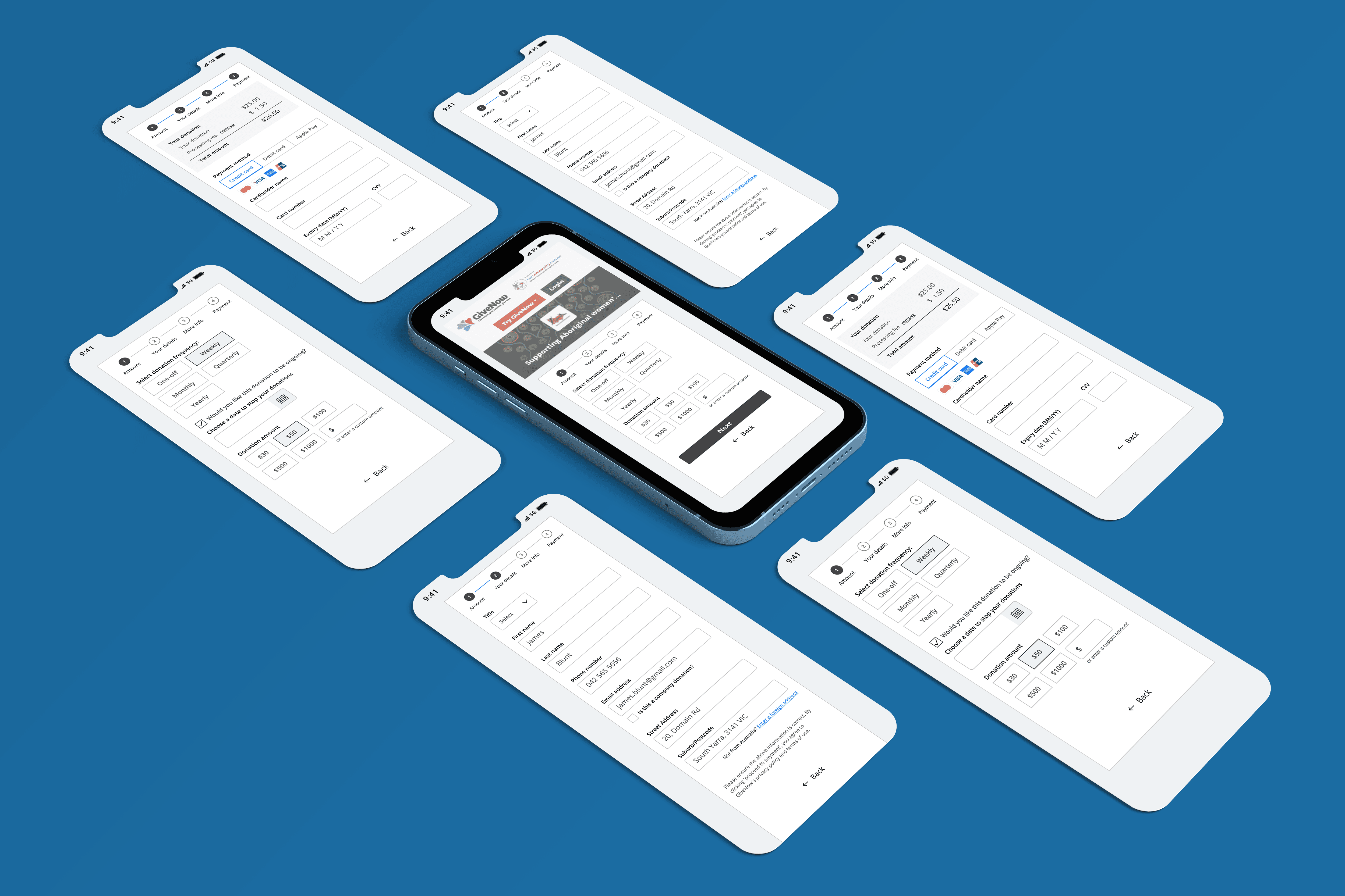
One of our main focus for project is to make the new flow more mobile friendly as a large percentage of users donate thru mobile . We also want to create distinctive sections so users get an idea how long the process might take.
A refresher to the design to enhance visual appearance whilst implement a solution with accessibility in mind was one of our objective too.
02
EXPLANATION OF APPROACH
Discover
Competitor analysis was conducted to see what exist out in the market
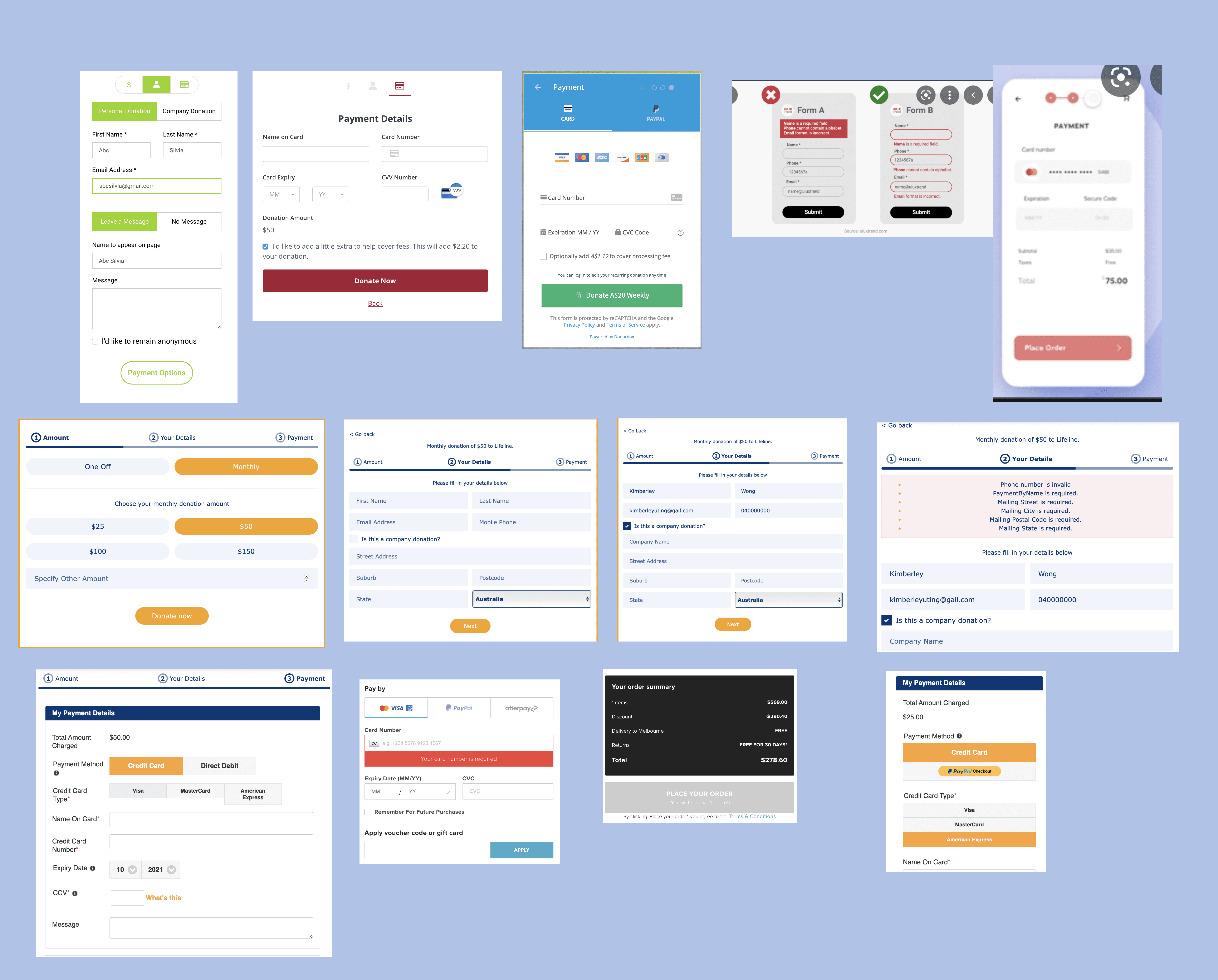
Highlight for the approach of project
We define requirements for this project - what are the must have, good to have, agreed outcome for this project that balances both customers and business needs.
There were a few key features & delivery for the project. These include :
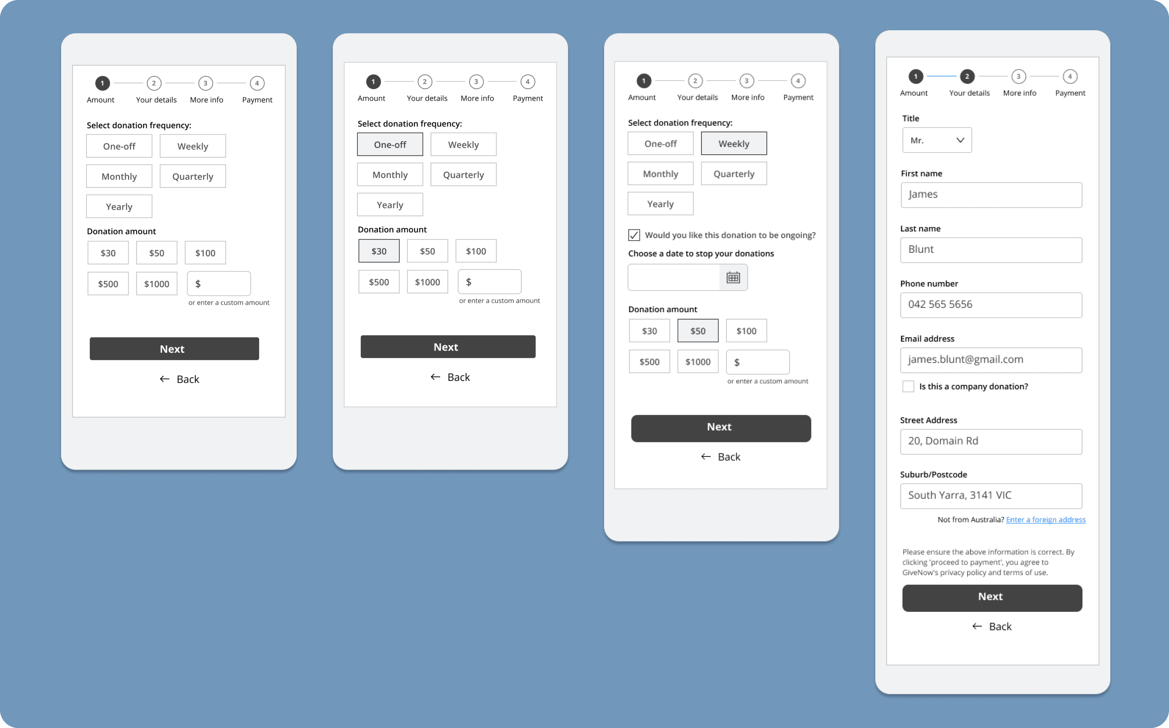
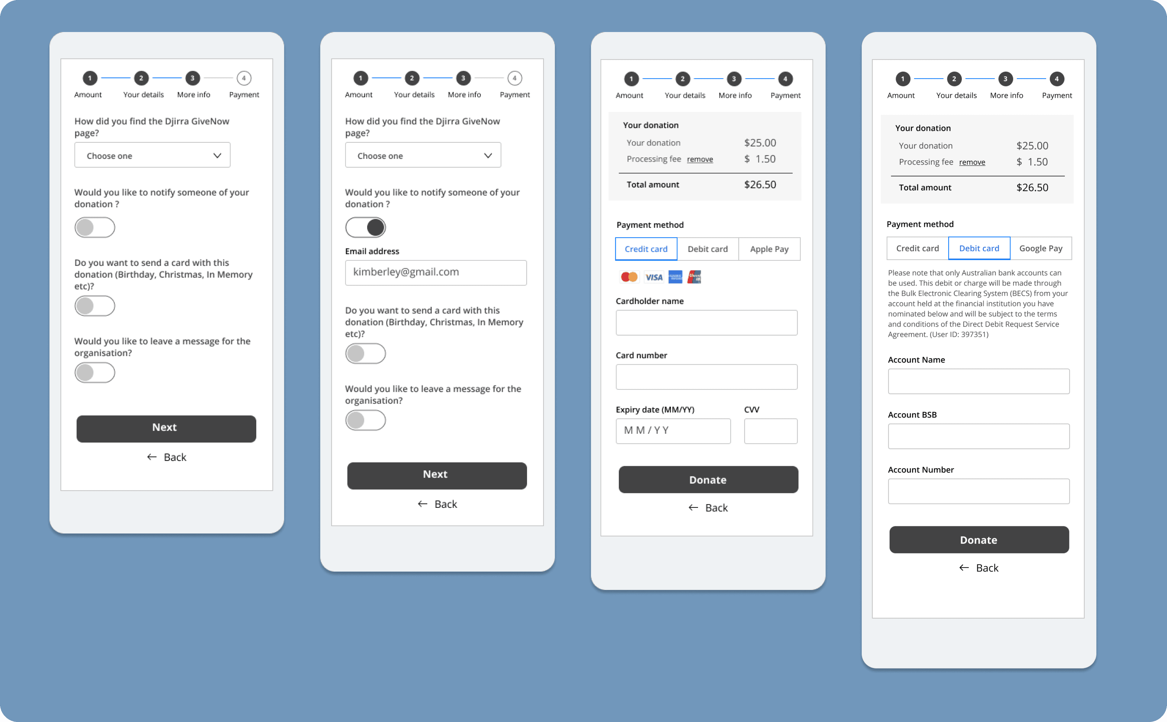
Introducing progress bar pattern
Defining the function of form label
Building a library system to ensure consistency
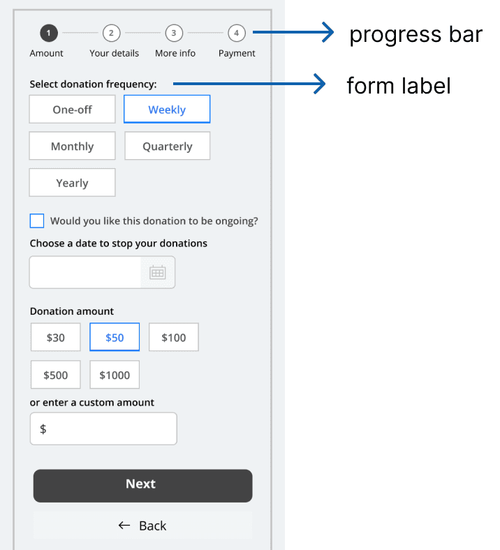
Progress bar
Gives user an indication of where they are in the form.
Also creates anticipation that they are about to complete the form
Form label
Avoid animated form label such as float label pattern as they are less accessible
Top aligned - easiest for users to process and scan , higher completion rate
Library system
Setting up library system is useful for the following reasons :
Ensure consistent use of element for the flow
Cost saving for built.
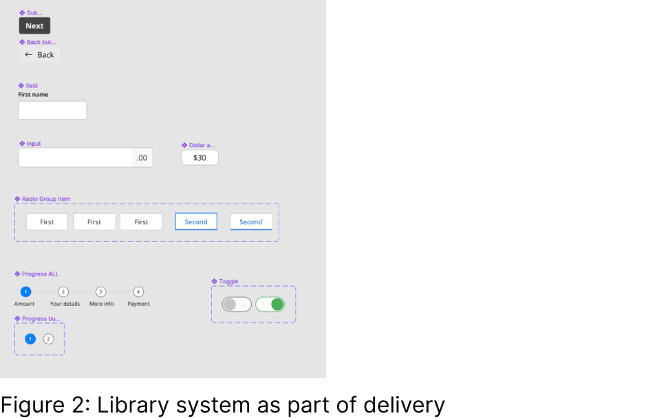
Summary
split out long form into 4 different flows . Clients can customise their form based on their requirements.
easy to scan form label means more incentive to complete payment
03
FINAL DESIGN
